

People open Instagram to see fresh, sharp visuals. Stories move fast. Each frame lasts a few seconds.
Good files help your work stand out. A clean PNG can make a huge difference. The edges stay crisp. Colors hold steady. Logos keep their shape. Text stays clear on small screens.
Many creators still feel confused about PNG on Stories. Some worry about file size. Some face color shifts after upload.
Some lose transparency and see a flat image. You can avoid these issues with a simple process.
You only need the right canvas size, the right color space, and a smart export method. Then each Story will load fast and look consistent on any phone.
This guide walks you through the full workflow. You will learn the correct dimensions. You will learn safe areas.
You will set up colors and fonts that hold up under compression. You will design with readability in mind.
You will export with confidence. You will also see fixes for common problems. Each section uses simple language.
Each step is clear and practical. You can follow it today and see results in your next Story post.
What a PNG Does Best on Instagram Stories
A PNG keeps detail. It holds sharp edges on text and icons. It supports transparency. This helps when you stack a logo or a cutout on top of a photo.
You avoid a white box behind your mark. You avoid fuzzy edges around letters. Your brand looks clean. Your design looks pro.
A PNG also uses lossless compression. That means you do not lose detail inside the file. The platform may compress on upload. The file itself will hold its best version. This helps with archival.
This helps with repurposing. You can reuse your Instagram Stories assets across Reels covers, Highlights covers, or ad mockups.
A PNG is not perfect in every case. Photos with complex gradients often look fine as high-quality JPEGs. Video remains the best choice for motion.
APNG does not help because Instagram does not treat it as an animation format. Use PNG where it shines. Use it when you need crisp type, clean logos, or a transparent overlay.
The Ideal Canvas: Size, Ratio, and Safe Areas
Set your canvas to a 9:16 ratio. The most common size is 1080 × 1920 pixels. This gives you a balance of clarity and speed.
Mobile networks still vary. Lighter files load faster. Your audience stays longer when the frame does not stutter.
Keep a safe margin around key elements. The top bar holds the profile photo and name. The bottom area shows reply UI and quick reactions.
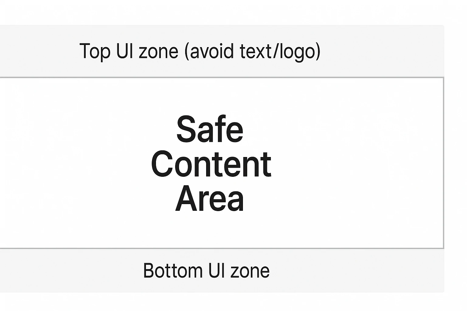
Leave about 250 pixels clear at the top and 250 pixels at the bottom. Place titles, logos, and calls to action in the center band. You get fewer overlaps. You get fewer taps lost to screen clutter.
Use the same size for all slides in a series. Your carousel will feel smooth. Your grid, type, and logo will sit in the same places.
The viewer reads faster. The brain relaxes when alignment stays steady from slide to slide. This small discipline lifts your brand.
Color Space, Bit Depth, and Why They Matter
Set your color space to sRGB. Most phone screens and social apps expect sRGB. A wide-gamut profile can shift tones after upload.
That shift can hurt brand colors. It can turn skin tones a little off. Lock sRGB at export and during your design stage. You will see fewer surprises.
Use PNG-24 when your slide has gradients, soft edges, or transparency. The extra depth keeps halos away.
Your transparent edges will blend better with backgrounds inside the app. PNG-8 can work with flat shapes or simple icons.
It yields smaller files. Choose based on content. Complex looks need PNG-24. Simple looks can pass on PNG-8.
Avoid hidden color-profile chaos. Do not mix images with different profiles on one canvas.
Convert images to sRGB before you drop them in. Keep a single workflow. Consistency pays off at upload time.
Palette Rules That Survive Compression
Limit your palette. Use four to six core colors. The brand feels steady across slides. The file size also stays low.
Keep contrast strong. Text should pass a quick eye test in daylight and at night. Pale text on a pale field fails on many phones.
White text on pure neon also fails at low brightness. Add a light overlay or a soft texture. The letters pop again.
Lock sRGB in your design app. Do not mix Display-P3 assets. Do not grab screenshots from wide-gamut sources. Color drift can appear after upload. One profile avoids that risk.
Typography That Survives Compression and Small Screens
Pick type that reads fast. Use a font with clear shapes. Avoid thin hairlines. Use weights that survive shrink and compression.
Medium and Semibold weights hold up well. Keep letter spacing modest. Tight tracking can mush letters on older phones.
Headlines can sit in the 72–120 px range at 1080 × 1920. Body text can sit in the 36–48 px range. Adjust for your font.
Some families look larger at the same size. Place text over a strong contrast. If the background is busy, add a soft overlay. Ten to twenty percent black or white can calm the photo and lift text.
Keep lines short. Short lines help speed. People scan Stories with their thumb on the screen. Long sentences can feel heavy.
Break thoughts into two or three short lines. Use language that any reader can follow. Your message should be clear at a glance. No one wants to decode jargon in three seconds.
Building a Clean Layout Grid for Story Slides
A grid turns chaos into order. Define a top zone for titles. Define a middle zone for the main message. Define a bottom zone for your call to action.
Repeat that structure on each slide. The viewer learns the pattern. The eyes find what matters without extra effort.
Use a base spacing unit. Eight pixels is a good unit. Use multiples of eight for margins, gaps, and padding.
Buttons feel balanced when the spacing ties together. Cards look neat when edges align to the same rhythm. This simple rule gives polish to any slide, even if the design is minimal.
Keep the main content inside the center band. The center band spans roughly 1080 × 1420 in the middle of the canvas.
Titles, icons, prices, and CTAs live well in this space. Nothing collides with the UI chrome at top or bottom. Nothing hides under the reply area. The result looks intentional and calm.
Using Transparency the Right Way
A transparent PNG lets you float an object above a background. You can place a cutout product on top of a color field. You can drop a logo on a photo without a box. The look feels premium. The edges feel clean.
Some uploads flatten transparency. This happens in certain device and app paths. A reliable path is to paste the asset from the clipboard into the Story composer.
Another path is the “Photos” sticker on iOS, which can keep edges clean. Test your path with one slide. Confirm how the app handles alpha. Then build your full set.
Mind edge smoothing. Anti-aliasing can pick up faint halos if the background changes. Add a one-pixel stroke in a color close to the background when needed.
This trick can hide the halo. You can also place the object on a subtle drop shadow set very soft. The eye reads separation. The edge looks intentional, not messy.
Mobile-Only Workflow (On-Phone Creation)
Many creators work only on a phone. The process can still stay clean. You only need a simple setup and a steady routine. Results can match desktop work in many cases.
iOS users can add transparent assets through the Photos sticker. Paste from the clipboard if the sticker fails.
Airdrop keeps color profiles safe. The PNG stays in sRGB. The edge stays sharp on upload. Android users can export from Canva or a similar app.
Share the final file to Instagram from the gallery. The app path reduces extra compression in most cases.
Avoid chat apps for file transfer. Many chats strip color data. The PNG can shift after upload. Save assets in your Files app or Photos.
Keep a small “Brand Kit” folder on the phone. Add logo, badges, and a blank Story canvas at 1080 × 1920. You will move faster and keep quality steady.
Delivery Paths and Transparency Gotchas
Transparency can fail on some routes. A chat app can flatten alpha. A cloud preview can rewrite color profiles. The fix is simple. Use direct transfer and test one slide.
Airdrop or cable transfer keeps the file pure. Email can work if you select “Actual Size.”
Cloud drives can work if you download the original file. Do not take screenshots of assets. Screenshots strip alpha and change color.
Test your route with one PNG. Post to a close friend’s list. Check edges, color, and sharpness. Pick the path that passes. Use that path every time. Consistency lowers risk.
Decision Tree: PNG vs JPEG vs Video
Ask one question first. Does the slide rely on crisp type or icons? Use PNG. A flat design can also use PNG-8 to cut size. A gradient or soft edge needs PNG-24.
A photo with rich detail can start as JPEG. Keep quality high at export. Add text in your editor. Export one final PNG-24.
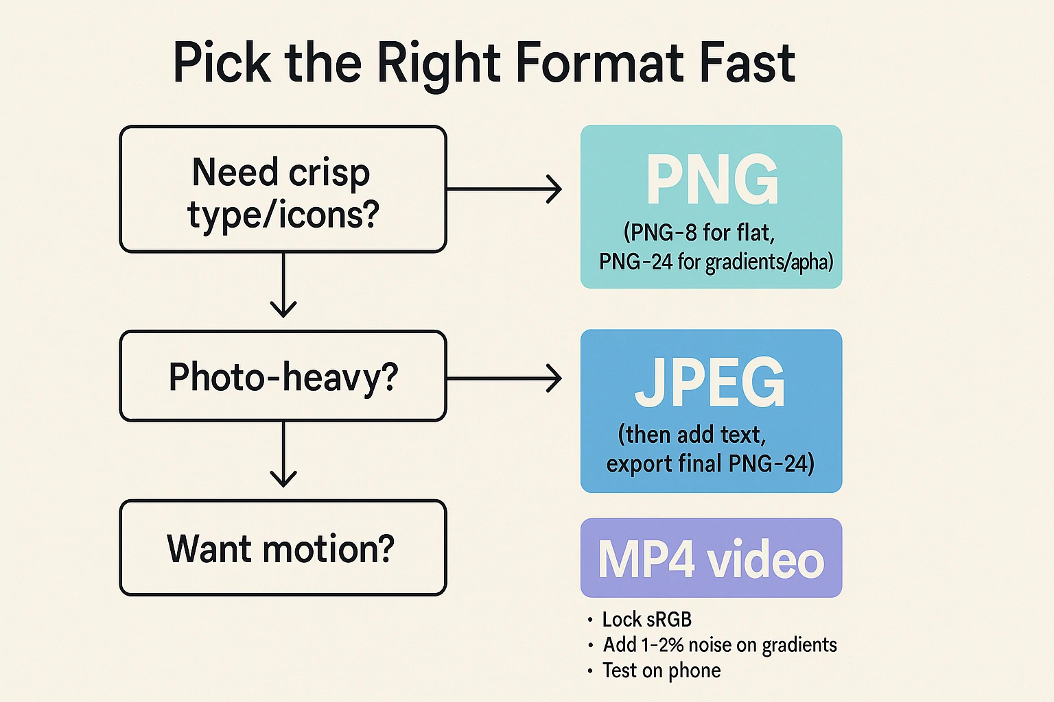
Double compression hurts more than a single clean step. A motion idea does not fit PNG at all. Use MP4 video with the same 9:16 frame. The tap rate often improves with motion.
Neon or heavy gradients need care. Add one to two percent noise to avoid banding. Keep sRGB on. Test on a mid-range phone. Adjust until the field looks smooth in bright light and in dim light.
Photos, PNG, and When to Use JPEG Instead
PNG excels with graphics. JPEG excels with complex photos. A photo slide with full-bleed landscapes often looks fine as a high-quality JPEG.
The file comes out lighter. Uploads go faster. You can still overlay a transparent PNG logo on top, inside the app or in your editor.
Use PNG when the photo needs clean vector-like edges. Infographics and charts benefit from PNG. Flat UI elements also benefit. If you must mix, export the background as JPEG.
Export the logo or sticker as PNG. Composite them in your editor, then export one final PNG-24. The final file stays simple for the app.
Do not over-compress photos before you export the final slide. Double compression can hurt. Keep a high-quality source in your editor.
Export once at the end. You avoid artifacts and banding. The result looks smooth, even under the platform’s extra pass.
Crafting Brand-Ready Story Templates
A template saves time. It also locks brand discipline. Set a master file at 1080 × 1920. Add guides at the safe areas.
Place text styles for titles, subtitles, and body. Save brand colors as swatches. Drop your logo into a fixed corner. Keep it legible and subtle.
Build a few template families. One for product drops. One for event promos. One for tips or how-to slides. One for news or quotes.
Each family shares the same type scale and spacing. Only the content changes. Your feed looks consistent. Your team moves faster.
Include a clear call to action. Use short verbs. Examples include “Shop now,” “Learn more,” or “Book today.” Test button sizes against fingers.
A big thumb should not miss the tap target. Keep the CTA inside the center band. The bottom UI covers small buttons. You want the action visible at a glance.
Storytelling With Multi-Slide Sequences
A single slide is a headline. A sequence is a full story. Start with a hook. State a clear promise. Tell the viewer what they get if they keep watching.
Move to the core value slide. Show the benefit. Show the proof. Add one slide with a simple diagram or a before-and-after. Close with a strong CTA.
Keep a rhythm across slides. The title sits in the same place. The logo sits in the same place. The color tone stays aligned. The visuals change, yet the frame stays familiar.
People process the flow with less effort. Drop clutter. Each slide should focus on one idea. That idea must fit in two or three short lines.
Use “tap to reveal” beats. Place set-ups on one slide. Deliver the answer on the next. This creates a micro cliffhanger.
The viewer taps forward. Retention rises. Your brand earns more seconds of attention. Attention is the real currency on social.
CTA Frameworks and Microcopy
Clear actions lift results. Small words can move a thumb. Pick one promise and keep it short. A button does not need flair. It needs a reason.
Use value lines. “Get the checklist.” “See the colors.” “Book a spot.” Use urgency lines with care. “Ends tonight.” “Last 20 left.”
“Price goes up at 9 PM.” Use social triggers. “Tap to vote.” “Pick a side.” “Tell us your pick.” The tap feels light and fun.
Place the CTA in the center band. Keep hit targets large. Leave room around the button. A cramped button feels cheap. A clear button feels safe to tap.
Accessibility and Readability
Design for light and dark phone settings. High contrast helps in both modes. Avoid low-contrast pairings like pale gray on white.
Avoid neon text on busy photos. The ADA contrast ratio target is a good guide. You do not need to memorize numbers.
Use your eyes on a real phone in daylight and at night. If it reads fast in both, you are safe.
Add captions when you include long quotes or tips. Many people watch with sound off. Text must carry the message.
Keep decorative fonts for big headlines only. Use a simple sans serif for body. Your message should help a tired eye, not fight it.
Do not pack the slide with too much copy. Stories move fast. The brain needs quick signals. Use three to five lines per idea.
Break points into short sentences. You can fit more ideas across a sequence, not on one slide. Leave white space. White space is not wasted space. It gives your content room to breathe.
Export Settings in Popular Tools
Photoshop produces reliable PNGs. Set your document to 1080 × 1920. Use sRGB. Export with “Export As → PNG.” Turn on “Convert to sRGB.” Strip metadata to keep size low.
Keep your final file under a few megabytes. Smaller loads faster. The app still looks sharp at this size.
Illustrator works well for vector slides. Build artboards at 1080 × 1920. Export with “Export for Screens → PNG.” Choose “Art Optimized” anti-aliasing.
Embed the sRGB profile. Raster effects at 150–300 ppi are fine. You do not need higher for Stories.
Figma keeps teams aligned. Create a frame at 1080 × 1920. Set your type styles and color tokens. Export as PNG.
Use the sRGB profile. Use “1x” to avoid giant files. Figma helps you batch-export a full sequence. This saves time on larger campaigns.
Canva offers a simple path. Pick the Story preset. Lock your brand kit. Export as PNG. Use the transparent background option when you need cutouts.
Keep the final output at standard size to avoid bloat. Test a sample on your phone to confirm clarity.
File Size Control Without Quality Loss
Big files stall on weak networks. Keep the balance. Use PNG-8 on flat graphics. Use PNG-24 only when you need gradients or soft edges.
Reduce extra layers. Remove hidden objects. Flatten smart filters when you finish the design. Each small step drops the file size a little.
Avoid giant drop shadows. Huge soft glows eat bytes. Use subtle shadows. Keep the blur radius moderate.
The look stays modern and light. The file stays lean. Watch out for full-bleed textures at massive resolutions. Crop them to the canvas size. Do not place a 6K texture under a 1080 × 1920 slide.
Test with a simple rule. If your slide crosses 5 MB with little detail, optimize. You can often get the same look at half the size. A small reduction in effects or a smarter palette can shave a lot off the total.
Preventing Banding in Gradients
Banding can ruin a calm background. Soft tones break into visible steps. The fix is simple. Add a tiny noise layer.
One to two percent noise hides the steps. The eye reads a smooth field again. Use PNG-24 so the soft blend holds up.
Keep gradients moving across shorter distances. A long, slow gradient bands more. Shorten the shift between colors.
Add a subtle texture overlay. Textured fields band less. The image feels tactile. The style looks modern. The file size barely changes if the texture is small and well compressed.
Test on a real device. A gradient that looks perfect on a desktop screen can band on a mid-range phone. Trust device tests over assumptions. Adjust until the phone passes.
Using PNG Logos the Smart Way
A logo should be simple, sharp, and quiet. Place it in a consistent corner. Avoid crowding the main message.
The viewer knows your brand after a few frames. A giant watermark can feel loud. Aim for trust, not noise.
Use a single-color mark on busy photos. White or black often works best. You can also place the mark on a small badge or pill with soft transparency.
The badge creates contrast with any background. The logo stays readable without a heavy box.
Export the logo once as a master PNG-24. Keep a dark and a light version. Use the one that fits the slide.
Do not re-export from random sources each time. Quality slips when files pass through many hands and tools.
Product Overlays and Cutouts
Cutouts sell the object. Viewers love to see the item clean and large. Use a careful selection tool. Refine hairlines and soft edges.
Avoid harsh eraser marks. A soft defringe around two pixels can clean halos. Place a faint ground shadow under the item. The brain reads it as real, not floating in space.
Add a price tag or a short benefit near the item. Keep the label short. Place it inside the safe area.
Do not sit a label on the extreme edges. The slide should let the eye travel in a Z or L pattern. The object leads. The label confirms. The CTA closes the loop.
If you must add many items, split them across slides. Clutter kills the sale. Each slide should hero one item or a clean group. Build a rhythm. The viewer taps forward with trust.
Infographics and Charts as PNG
A chart needs lines that hold sharp edges. PNG handles that well. Keep the palette simple. Use three to five colors.
Label lines with short names. Place values at key points. Avoid tiny legends that require a pause. The slide must read at a glance.
Use a strong contrast between the chart and the background. If the background is a photo, dim it a little.
Keep axes thick enough to survive compression. Avoid hairlines under one pixel. The viewer may see a broken line on small screens.
Summarize the insight in one short sentence near the top. The chart is proof. The sentence is the takeaway. The viewer should know the point even if they glance for only two seconds.
A/B Testing Your PNG Slides
Test two versions. Change one element at a time. Try a darker overlay. Try a heavier font weight. Try a shorter CTA.
Watch completion rate across the sequence. Watch reply and link taps. Data tells you what the eye likes.
Keep the test small. You do not need huge samples. A few posts across similar days can show a trend.
Use consistent timing and topics. Do not compare a sale day to a slow day. Take notes. Build a playbook. A pattern will emerge within a few cycles.
Save winning templates. Retire weak ones. Your library will get better over time. A good library makes fast work when deadlines hit.
Troubleshooting Matrix
| Issue | Likely Cause | Fast Fix |
|---|---|---|
| Fuzzy text | Thin weight, low contrast, small size | Use medium/semibold, increase size, add soft shadow or 1 px stroke, confirm sRGB, export once |
| Color shift | Mixed profiles, wide-gamut assets | Convert all assets to sRGB, export final again |
| Transparency lost | Chat/cloud path flattened alpha | Paste via clipboard/Photos sticker, transfer via AirDrop or cable, avoid chat apps |
| Heavy file | Large textures, big glows, metadata | PNG-8 on flat art, trim textures, reduce glow radius, strip metadata |
| Gradient banding | Shallow depth, long ramps | PNG-24, add 1–2% noise, shorten gradient span, add soft texture |
| Harsh logo | Busy photo, weak contrast | One-color mark on translucent pill, correct corner placement, reduce size slightly |
Workflow: From Idea to Final Story PNG
Start with a goal. Do you want traffic, saves, or replies? The goal guides the slide plan. Write a short script of two to five slides.
Each slide gets one idea. Keep the thread tight. Use a hook first. Show value next. Close with a clear action.
Open your template file. Drop in the new copy and visuals. Align to the grid. Check safe areas. Run a phone preview.
Fix any crowding. Tweak contrast until text pops. Remove any extras that do not serve the goal.
Export as PNG. Keep sRGB on. Keep size modest. AirDrop or transfer to your phone without extra compression.
Post the sequence. Watch metrics. Save notes. Repeat with small improvements in the next set. Simple habits beat complex hacks.
Team Handoff and Version Control
Teams need clarity. Store master templates in a shared folder. Name files with date and version. Write a short readme on type sizes, color codes, and safe areas.
Put export steps in one page. New members can ship work on day one if your system is clear.
Lock brand assets. Place logos, icons, and badges in a single shared kit. Do not hunt old files across chats.
Replace legacy assets with the newest kit. Little bits drift over time. Tight control keeps the brand steady.
Review slides on a real device. A desktop mockup can fool your eye. The phone view will tell the truth.
Check in bright light and in dim light. Fix issues fast. Then post with confidence.
File Hygiene: Names, Versions, Metadata
Clean files save time. A good name stops guesswork. A clear folder keeps the set intact. The team can ship without delay.
Use names that show topic, size, and version. Example: brand_story-sale_v03_1080x1920_sRGB.png.
Use folders per campaign date. Example: 2025-10-02_fall-drop/01_hook.png and so on. The pattern helps track changes and approvals.
Strip metadata on export. EXIF adds weight and private notes. Keep a short text file in the folder with color codes, font sizes, and CTA rules. New members can follow the system on day one.
Content Ideas That Work Well as Story PNGs
Quote cards highlight a key thought. Keep one quote per slide. Use a clean background. Add a small author line. These slides get quick saves.
Tip cards deliver quick value. Use a three-step breakdown across three slides. Each step fits in two or three lines. Use icons to support each step. Action beats theory in this format.
Before-and-after slides speak loud with few words. Show the change. Place a short caption near the bottom. People love clear outcomes. Do not over-explain. Let the image do the heavy lift.
Event promo slides help your timeline. Use date, time, and place in large type. Add one line on the value. Add a CTA such as “Set reminder.” Keep the layout clean and bold.
Niche Playbooks
E-commerce: Use a hero cutout with a soft ground shadow. Add one clear benefit and a price tag.
Keep a short SKU code near the corner. Close with a big “Shop now” button. A three-slide set can show hero, detail, and CTA.
Restaurants: Post a daily special card. Use a clean photo and a short dish name. Add allergen icons and a time window.
Place a QR code that links to the full menu. People decide fast when the card is simple.
Coaches and Educators: Share a three-step tip. Use one icon per step. Keep lines short and active. Close with “Save this guide.” Saves lift reach over time.
Local Events and Creators: Lock date, time, and place in a strong block. Add a small map pin icon.
Use a “Set reminder” QR or link sticker on the last slide. Add a recap slide after the event with two photos and one thank-you line.
Photographers and Portfolios: Keep a discreet watermark in one corner. Use sRGB to protect skin tones. Add a soft overlay behind captions. People read faster over a calm field.
Ethical and Legal Notes
Respect rights on all images. Use your own photos, licensed stock, or creator work with permission.
Credit when the license asks for it. Do not lift assets from random sources. A clean legal path keeps your brand safe.
Be honest in overlays. Do not place fake badges or fake claims. Trust builds slow and breaks fast.
The short life of a Story does not reduce risk. Viewers remember strong brands that act with care.
Follow accessibility ideas as best practice. High contrast helps many people. Clear language helps everyone. Ethical design is not a trend. It is part of respect for your audience.
Brand Safety and Compliance Notes
Paid content needs a clear label. Add “Ad” or “Paid partnership” near the top safe band. The mark should stay readable on any background. The rule protects trust and avoids reports.
Keep proof of stock licenses in the same campaign folder. Add a small note file with links or receipts.
Legal checks move faster when records sit in one place. A client or partner can review without delay.
Use real quotes in testimonial slides. Ask for text approval in writing. Keep the approval note with the assets. The process takes minutes and avoids hard problems later.
Turning Story PNGs Into Reusable Assets
A good Story slide can live again as a Reel cover, a Highlight cover, a Pinterest pin, or an email header. Save a square version and a 4:5 version if you plan ahead.
Keep your type styles and colors matched across formats. The brand will feel strong across channels.
Archive your best sets. Label the folder with topic and date. Reuse a set when the theme comes back. Update the copy. Keep the structure. Your workload drops. Your output stays high.
Build a simple index spreadsheet. Add columns for topic, date, format, and link. This stops lost assets. This saves time each month. Small systems free creative energy for the next idea.
From PNG to Ads, Covers, and Pins
A strong Story can seed many formats. You only need small tweaks. The brand look stays the same, so output feels cohesive.
Reel cover: Start with the Story PNG. Keep the center band clear. Export as PNG-24 again. Check the crop in the Reel picker. The title should sit high and stay inside safe bounds.
Highlight cover: Switch to a square canvas at 1080 × 1080. Place the icon in the center. Leave room for the circular frame. Keep a flat color field and a single icon. The set looks clean on your profile.
Pinterest pin: Use 1000 × 1500. Re-use the headline and a small product cutout. Keep a short CTA. Export as PNG-24. Pins prefer clarity over heavy effects.
Performance Tips and Light Optimization
Post when your audience shows up. Study your insights. Aim for your top hour. A strong asset still needs timing. Good timing lifts reach and replies.
Front-load value in the first slide. The first seconds decide the rest. A clear headline and a clean visual pull the viewer in. Then deliver on the promise in the next slide. Do not tease without pay-off.
Engage with replies quickly after posting. Early interactions can help momentum. Thank people.
Answer short questions. Save FAQ themes for a full Story set later. This loop builds community, not just reach.
Advanced Touches Without Heavy Files
Use subtle motion only if you export as video. If you want to stay with PNG, suggest motion with diagonal lines, angled crops, or dynamic type placement. The eye reads movement even in static frames.
Add micro-textures at low opacity. A paper grain at five to ten percent can make flat fields feel rich.
Keep the texture tile small. Repeat cleanly. The file size will stay low if you manage the layer right.
Use color math with care. Analogous palettes create calm. Complementary pairs create pop.
Keep saturation under control. Over-saturation can break under compression. Test on a real device to confirm balance.
Case Study: A Three-Slide Product Drop
Slide 1: Hook
A full-bleed product cutout sits center. A soft ground shadow adds depth. A short headline says the key benefit in four words. The logo sits small in the top corner. The CTA waits for the last slide.
Slide 2: Proof
Two lines show the main spec and a simple comparison. A mini chart shows “more power, less weight.” The background uses a subtle gradient with one percent noise. Text pops with high contrast.
Slide 3: Action
Price and a limited window appear near the center. A bold button says “Shop now.” The bottom area stays clear of UI.
The slide leaves no doubt about the next step. Each export stays under a few megabytes. The set posts smoothly and reads fast.
This simple pattern fits many products. Swap in features for specs. Swap in testimonials for charts.
Keep the bones the same. The brand stays tight. The viewer moves through the funnel with ease.
QA Checklist Before Export
- Canvas set to 1080 × 1920, 9:16
- sRGB set in the document and export
- Main text and CTA inside the center band
- Headline ≥ 72 px, body ≥ 36 px
- Clear contrast on bright and dim screens
- PNG-8 on flat art, PNG-24 on gradients or alpha
- File size under 5 MB if possible
- One export at the end, no double compression
- Test post to a close friend’s list before live
Glossary
- sRGB: A standard color space that matches most phones and social apps.
- PNG-8: A compact PNG for flat art and few colors.
- PNG-24: A richer PNG for gradients, soft edges, and transparency.
- Alpha: The transparency channel in an image.
- Anti-alias: A method that smooths jagged edges.
- Banding: Visible steps inside a gradient.
- Noise: A fine texture that hides banding.
- Safe Area: Zones away from UI bars where key content stays safe.
- CTA: A call to action such as “Shop now.”
- DPI: A print metric that does not change phone display quality.
Conclusion
A strong Instagram Story does not depend on luck. A clear process creates consistent results. Start with the right canvas and safe areas.
Lock sRGB from the start. Use PNG where it wins: sharp type, clean logos, and transparent overlays.
Keep photos as JPEG when they fit better. Balance beauty with file size. Test on a real phone. Fix small issues before you post.
Your layout grid will guide the eye. Your type scale will keep words readable. Your color discipline will protect your brand.
The platform may compress your work. A smart export will still hold quality. Viewers reward clarity. They pause for slides that respect time and attention.
You can build a library of templates that your whole team can use. You can turn each set into ads, pins, or email headers. You can test small changes and track what works.
Over time, your PNG slides will look refined, load fast, and convert well. The method here is simple. The gains last.
Use it now, post with confidence, and let your next Story frame speak for your brand in a clear voice.
Common FAQs
What size should I use for an Instagram Story PNG?
Use 1080 × 1920 pixels at a 9:16 ratio. This size looks sharp and loads fast on most phones.
Which color profile is best?
Use sRGB only. This profile matches how Instagram shows color on most devices.
Should I choose PNG-8 or PNG-24?
PNG-24 is best for gradients, soft edges, and transparency. PNG-8 works well for flat icons and simple shapes with few colors.
How do I keep text readable?
Use high contrast. Pick medium or semibold weights. Keep body text around 36–48 px. Place text over a soft overlay if the photo is busy.
Why does my PNG lose transparency?
Some upload paths flatten layers. Try pasting from the clipboard into the Story composer or use the Photos sticker on iOS. If the issue stays, export with a solid brand background.
How can I stop gradient banding?
Add one to two percent noise. Use PNG-24. Shorten the gradient range. A light texture also helps.
What file size is safe?
Stay within a few megabytes. Under five megabytes per slide is a solid target. Smaller loads are faster without a big hit to quality.
Can I reuse Story PNGs in ads or Reels covers?
Keep the same type and colors. Adjust the size to match the new placement. Check safe areas again.
Do DPI settings matter for Stories?
Pixel dimensions matter. DPI has little effect in this context.
What is the fastest way to build a series?
Create a template with a grid, styles, and safe areas. Swap content for each post. Export with the same settings each time.
Read Also Trending Post: What Is nhentai.nef? Real Meaning and Online Risks